Etho MindCrack FTB S2 – Episode 17: Biomes O’ Plenty
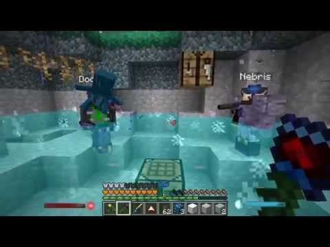
 Today we join up with Docm and Nebris to check out a new dimension that was added by Biomes O’ Plenty. Then we head over to the castle to try change out the …
Tags: craft, creative, episode, etho, ethos, ethoslab, game, guide, lets, lp, map, mine, minecraft, play, player, tips, tour, tricks, tutorial, video, world
Filed under EthosLab :
Comments (20) :
Apr 1st, 2014
20 Responses to “Etho MindCrack FTB S2 – Episode 17: Biomes O’ Plenty”
Leave a Reply
You must be logged in to post a comment.
April 1st, 2014 at 8:53 AM
Etho you have lasers, definitely change the theme of the castle to
something space age like tron
April 1st, 2014 at 8:55 AM
The bleached is amazing
April 1st, 2014 at 8:55 AM
I think the blue looked really nice
April 1st, 2014 at 8:56 AM
Keep the Infernal stuff and the blue blocks on your castle. It looks
reallly cool =]
April 1st, 2014 at 8:57 AM
The blue rocks!
April 1st, 2014 at 8:58 AM
Combine white stone and grey stone
April 1st, 2014 at 8:59 AM
Videos end better with the old intro, bring it back!
April 1st, 2014 at 9:01 AM
Why use an itemduct when you have BC pipes?
April 1st, 2014 at 9:05 AM
ethos you should post FTB more ofter please like if u agree
April 1st, 2014 at 9:13 AM
I have to say, some of those tools look like a lot of fun. It kinda makes
me want them in vanilla minecraft but I doubt that will ever happen. :P It
would definitely come in handy though.
April 1st, 2014 at 9:13 AM
how is nebris flying without jetpack?
April 1st, 2014 at 9:13 AM
I suggest smooth stone :)
April 1st, 2014 at 9:14 AM
White is the best
April 1st, 2014 at 9:16 AM
6
April 1st, 2014 at 9:18 AM
don’t the bushes work better in the dark or with the watering can?
April 1st, 2014 at 9:26 AM
I liked the black & blue
April 1st, 2014 at 9:28 AM
you can make that portal with a wand too
April 1st, 2014 at 9:29 AM
Use the sky stone for the background and the blue bricks for the front.
Like so he can see!
April 1st, 2014 at 9:35 AM
Hey Etho, just wanted to let you know that you got Skyblock Cobblestone
instead of the actual Skyblock. Your pick has silk touch, but equal trade
doesn’t.
April 1st, 2014 at 9:36 AM
I think the blue looks pretty good in small doses. If you made just the
corner faces blue or maybe every third face blue, I think it would look
pretty sweet!